


Recommended
Show

Winter Sale: Avail flat200 Off on bill value above1999/-. Use Code: WINTER200
Posted on September 09, 2020
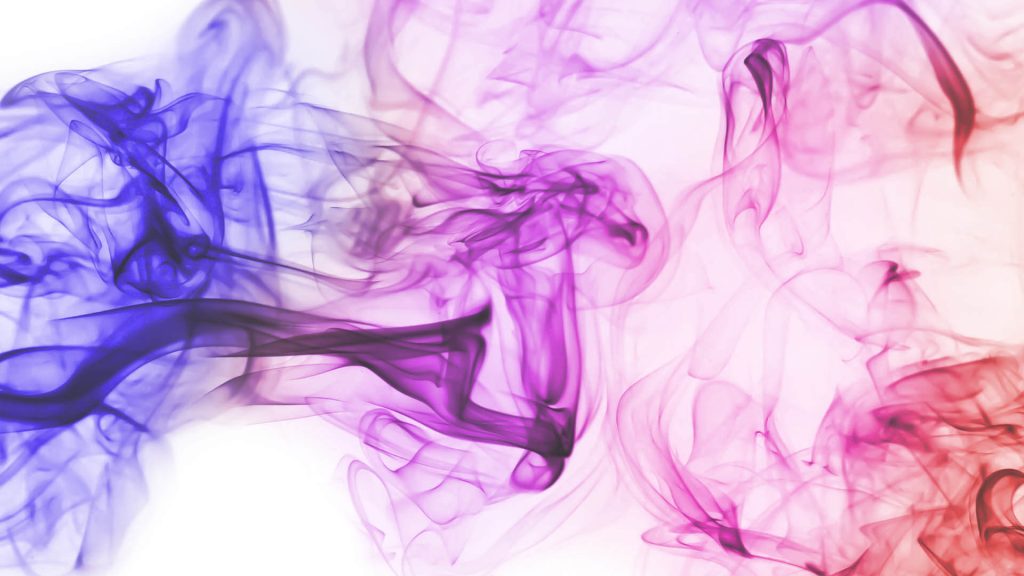
“Colour is a power which directly influences the soul.”
– Wassily Kandinsky
Did you know that people decide whether or not they like a product in 90 seconds or less and that 90% of that decision is based solely on colour?
For a brand, perception is everything, which is why colour and colour theory (the art and science of using colour) are so important. Even if you aren’t a brand manager or a graphic designer, you should know a little about the symbolism behind various colours because you are the brand ambassador of you.
There is a wealth of symbolism and psychology associated with every colour on the colour wheel, and you’ll need a drink at hand while we discuss the merits of our favourite colours; Lapis Bard, being keenly attuned to their customer’s needs, has created a superb line of twelve addictive, cocktail-themed fountain pen inks with merry colours and merrier names.
Here’s a list of our favourite inks and our favouritest cocktails:
Green is Good!
Green is very easy on the eye and can be used to create a calming effect. It represents nature, safety, and new beginnings. It’s a great colour for brands seeking to project an aura of sustainability. Companies like Starbucks and British Petroleum have created very recognizable and well-positioned brand identities with this colour.
Emerald Isle Ink from Lapis Bard is a lustrous emerald green that brings real poetry to the art of writing. This colour is inspired by its namesake cocktail – a divine blend of herbal and citrus notes with a touch of mint that is held together with a dash (or two) of bitters.
One tequila, two tequila, three tequila, floor!
Pink is a fun colour that is typically associated with femininity. While this has traditionally limited its use, the colour is now gaining fans across the gender spectrum. Instagram, Baskin Robbins, and Lyft are unisex brands that are spreading the love.
Lapis Bard’s Tequila Sunset cheerful shade of pink brings passion and energy to the page. The intense colour of the silky, fluid ink is offset by the facets of the crystal-clear bottle. This pretty shade is the inkquivalent of the delicious cocktail that entices the palate with citrusy notes, grenadine, and tequila.
If you’re going to blackout, make sure it’s worth it.
Black is an interesting choice because it’s actually the result of the absence of colour. This powerful colour is very versatile and it can be used for a brand that wishes to be known as edgy, formal, classic, or modern. Brands like Apple, Gillette, The New York Times and Chanel have all used this shade with remarkable success.
Get back to black with Lapis Bard’s Black Roska Ink, a classic shade that will always be in vogue. This deep shade gets its name from the Black Roska cocktail – a dark drink brewed with black vodka, blueberry liqueur, blueberries, and a hint of lemon.
Writing is the art of baring your soul. Everything about it (the colour of your ink, your handwriting, the words you choose etc.) is a reflection on you and your personal brand. Your audience (aka readers) can gain tremendous insight about you from just seeing your writing. So, choose a colour that reflects who you are or who you want to be, even when your only audience is you.
All twelve of Lapis Bard’s splendid ink colours come in 50 ml, irresistible, Avant Garde bottles. Find your shade today
William Penn
William Penn is premier destination for fine writing instruments and curated lifestyle accessories. We blend timeless craftsmanship with modern elegance to celebrate the art of expression.

-e80f1a09-921a-4d02-81c9-de41a080a2e2.jpg)
-6d0a9f85-3ca0-4694-901e-81f34714ada7.jpg)


Featured Brands
Explore Our Top Picks
Welcome to William Penn – Your Premier Destination for Luxury. Discover a world of exquisite writing instruments, accessories, and curated gifting options. With a rich heritage dating back to 2002, we bring you the finest brands and products that celebrate the art of writing and gifting. Explore our collection and experience the elegance and craftsmanship that define us. We are proud to be the licensed distributor of Sheaffer, an iconic American pen company, since 2003. Shop online and join us on a journey of timeless quality and sophistication with William Penn.
Welcome to William Penn – Your Premier Destination for Luxury. Discover a world of exquisite writing instruments, accessories, and curated gifting options. With a rich heritage dating back to 2002, we bring you the finest brands and products that celebrate the art of writing and gifting. Explore our collection and experience the elegance and craftsmanship that define us. We are proud to be the licensed distributor of Sheaffer, an iconic American pen company, since 2003. Shop online and join us on a journey of timeless quality and sophistication with William Penn.
Experience the timeless elegance of fountain pens, renowned for their smooth and sophisticated writing style
Precision meets convenience with our mechanical pencils, perfect for precise, fine lines
Enjoy the smooth and effortless writing experience that rollerball pens provide, combining style and functionality
Rollerball Pens: Enjoy the smooth and effortless writing experieOur premium ballpoint pens offer a reliable and consistent writing performance, ensuring your words flow effortlessly.nce that rollerball pens provide, combining style and functionality
Our high-quality ink and refills are designed to keep your writing instruments ready for every occasion. Explore a wide range of ink colors and refills to suit your preferences and ensure your writing always stands out.
Explore the captivating world of notebooks by William Penn, designed to capture your thoughts, dreams, and memories. Our diverse range encompasses:
Perfect for preserving your daily musings and reflections
Collectibles (including sacred texts): Unique and exquisite notebooks that include holy books like the Bhagavad Gita, offering a sacred space for your spiritual journey..
Designed to inspire creativity and accommodate your digital needs..
Boost productivity and stay organized with our carefully crafted planners
Elevate your style with William Penn's thoughtfully curated collection of accessories. Our comprehensive range encompasses
Our wallets are both timeless and practical, showcasing sophistication and exceptional craftsmanship. Belts: We offer refined leather belts that add a touch of elegance to any outfit
Our collection features sophisticated lighters that seamlessly blend style and functionality
We present premium bags that are designed to complement your busy lifestyle
Enhance your formal look with our fashionable cufflinks.
Discover leather watch straps and airpod cases that effortlessly merge fashion with technology.
Discover Caran d'Ache: A pinnacle of Swiss precision and artistic excellence, crafting fine writing instruments and vibrant colours for the discerning creator. Our colour and writing products have been manufactured in our workshops in Geneva since 1915
Step into the world of Jekyll and Hide's lifestyle and accessory brand, where quality craftsmanship and meticulous attention to detail are seamlessly woven into every product. Elevate your style effortlessly with our exquisite collection of jekyll and hide wallets, which embody refined taste and timeless elegance. Explore the perfect blend of functionality and sophistication, making Jekyll and Hide the ultimate choice for those who demand both form and function in their accessories.
Applying the skill and expertise garnered from being India’s premier address for fine writing and luxury accessories, William Penn refined the brand’s traditional English roots and expanded Lapis Bard’s core from writing instruments into an entire world of high-class accessories.
Experience the artistry of writing with Montblanc, known for its luxury fountain pens. With unparalleled craftsmanship and timeless design, Montblanc elevates your writing experience to new heights. Explore exquisite collections like Montblanc Wallets and discover a new way to express yourself through pen and paper.
Experience 180 years of German excellence with Pelikan, a brand known for its timeless legacy in luxury fountain pens. These pens are crafted with precision and reflect a rich heritage, redefining the art of writing. Elevate your writing journey with Pelikan's iconic collection, where tradition seamlessly merges with innovation in every stroke
Welcome to Sailor, your ultimate destination for premium-looking luxury fountain pens. Discover the world of Sailor and immerse yourself in the unparalleled craftsmanship of our nibs, including the highly sought-after 21k gold KOP nib. Experience the highest level of writing precision and witness every stroke become a masterpiece. Each Sailor pen is truly a work of art
Discover the enduring world of Sheaffer, a brand that represents a century of pride, heritage, and skilled craftsmanship in luxury fountain pens. Since 1913, Sheaffer has been renowned for its unmatched elegance in writing, transforming each pen into a symbol of refined taste. Enhance your writing journey with an esteemed legacy of sophistication and exceptional quality of Sheaffer Pens India.
Explore the long-lasting impact of Kaweco, the renowned German brand that has captivated writing enthusiasts for centuries. With a storied history and timeless design, Kaweco represents the epitome of luxury writing instruments. Enhance your writing experience with Kaweco's iconic pens that seamlessly blend tradition and innovation, leaving a lasting impression on every page
Unleash the power of Fisher Space Pen,the writing instrument trusted by NASA for its unparalleled performance. These pens defy gravity, writing underwater, through grease, and even in extreme temperatures. Elevate your writing experience with the pen that's out of this world.
Discover the spiritual journey with Nightingale, where the wisdom of the Bhagavad Gita is brought to life through carefully designed notebooks. Immerse yourself in the sacred teachings with our collection inspired by the Bhagavad Gita, aimed at enhancing your spiritual practice and sparking deep reflections. Embrace the essence of spirituality with Nightingale's thoughtfully created notebooks
Enhance your note-taking experience with Moleskine, the pinnacle of high-end luxury notebooks. Immerse yourself in the realm of exquisite craftsmanship and timeless design, where each page transforms into a canvas for your thoughts and ideas. Explore the ideal companion for your creative journey with Moleskine notebooks available on William Penn's platform.
Explore Pennline, your gateway to a world of fine notebooks, journals, ink cartridges, and more. With an exquisite range of writing essentials, Pennline caters to your every creative need. Elevate your writing and note-taking experience with Pennline's Diaries that have exceptional quality and craftsmanship, available at William Penn
Experience the peacefulness of mornings with Vahdam, a high-quality tea brand available on William Penn. Enhance your tea-drinking routine with our customized Flip Bottle, a considerate gift that brings a sense of serenity to your daily life. Discover Vahdam's exceptional tea collection and transform your mornings into a rejuvenating and tranquil experience, sip by sip. Find the ideal balance of flavor and mindfulness with Vahdam on William Penn.
Discover the wide range of Zippo lighters at William Penn, the renowned brand that offers an impressive selection of colors and designs. Whether you prefer timeless classics or contemporary creations, Zippo has the perfect accessory to enhance your daily experiences. Ignite your style with the art of fire and make a statement with every flick.
Enhance your writing experience with Cross, a renowned brand available on William Penn. Discover a range of luxurious Cross Pens, including ballpoints, rollerballs, and more, carefully crafted to perfection. Embrace timeless elegance and precision with Cross, where each stroke becomes a symbol of style and sophistication.
Experience effortless writing with Hugo Boss, the brand featured on William Penn. Our fine writing instruments redefine the art of penmanship, making every stroke a breeze. Elevate your writing with Hugo Boss, where style meets functionality in perfect harmony.
Explore the lasting legacy of Lamy, a brand renowned for its 50 years of German craftsmanship. We are committed to providing writing instruments of unparalleled quality, enhancing your writing experience. Each pen we create is a testament to precision and design, allowing you to write with confidence and style.
Discover the harmonious fusion of luxury and spirituality with Noblia, the exquisite brand showcased on William Penn. Our fountain pens proudly bear the revered inscription of Lord Ganesha, a symbol representing wisdom and prosperity, imbuing every stroke with divine significance. Elevate your writing journey and infuse your words with inspiring divinity, as Noblia caters to individuals who value the union of artistic expression and spirituality. Write with intention and grace, encapsulating the essence of tradition and opulence in each and every line.
Elevate your writing experience with Parker, the epitome of luxury and premium quality pens featured on William Penn. Crafted with precision and timeless design, Parker pens are the perfect blend of style and functionality. Discover the art of writing with elegance, where every pen becomes a statement of sophistication.
Experience the perfect fusion of style and functionality with Secrid, the brand featured on William Penn. Our card holders, available in various colors and patterns, are designed to complement both men and women. Elevate your everyday carry with Secrid, where fashion meets practicality in the most stylish way possible.
Explore a wide range of thoughtful gifting options with our Corporate and Personal Gift Sets available on William Penn. These carefully curated sets include a variety of timeless products, such as pens, wallets, and laptop gifts, designed to enhance your gifting experience. Whether you are looking for gifts for colleagues or loved ones, these classic and exquisite items are guaranteed to make any occasion memorable. Take advantage of this opportunity to create lasting memories – visit our website today to discover the perfect gift sets and make your next celebration truly remarkable.


